I have known the 30 day map challenge for two years now, but I was always too shy to join it. But the whole point is to have fun and learn something along the way, so here I am! I will update this post daily with my maps and the link to the code on my github repo. I missed the first two days, so I’m starting from day 3.
Dec 1st update: This has been a great challenge! I got really busy this month so I couldn’t make maps or update this post daily as expected. All in all, I could talk a little about what matters to me through maps and learn new techniques I was keen to explore. Some days I was really pumped and really dedicated myself to these maps, whereas in others I just wanted to get over with it. I will definitely try again another time, maybe next year!
Day three: polygons
I spent some five hours making this, and I sadly lost my original code because I was stupid enought to not save the file. Accidents happen, so always save your files! Fortunately, I was at a loose end enough to recreate it.
The inspiration for this came from this tweet from @_palenrique, where he compared Brazil’s Federal District size to other huge metropolitan areas.
The biggest challenge was how to get all metropolitan areas in the same scale. I had a notion that I should use coord_sf() in my ggplot to make them all in the same frame, but I just didn’t know how to get a bounding box with the same widths for the different regions. Then I had an idea: what if I calculate a buffer from the region’s centroid to the bounding box limit and use this constant ratio to create a buffer & a bounding box for each city?
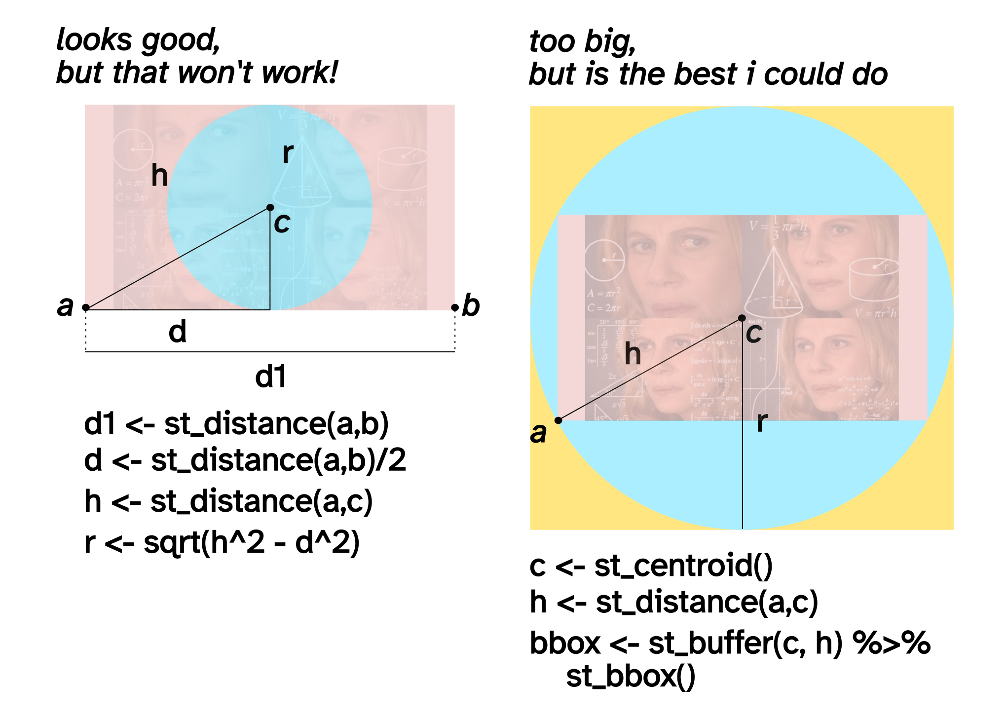
Anyways, here it is!
- Fork me on GitHub
This version is actually a little better than the original one, which you can still find on twitter.
Day four: a bad map!
Whenever I think of a bad map, three things come to my mind: clumsy information, bad colors, and the amazing @TerribleMaps twitter page. Then I thought, what can be both totally useful and disturbing at the same time? The answer was on my face: I’ve always been fascinated by how my home state of Minas Gerais looks like a face with a big nose and booger coming out of it, so I manually created a list of cities for each feature and ggploted it.
- Fork me on GitHub
Later on, I found out that gaga stans really liked it. I had no idea they had an internal joke about her!
Day five: an analog map
Okay, I’m assuming this means I use no digital thing to make this, am I right? Since a kid/pre-teen I have always loved to draw maps, especially during boring classes in school. So that’s what I did, but this time using fountain pains!
I tried it five times before my final version. I ended up starting by Minas Gerais… And it says a lot that Minas is bigger than Amazonas on my map! Perhaps we increase the things we have a better grasp. I’m so used to Minas and the Southeast that all I can say is sorry for my terrible borders. At least I got all states and capitals right…
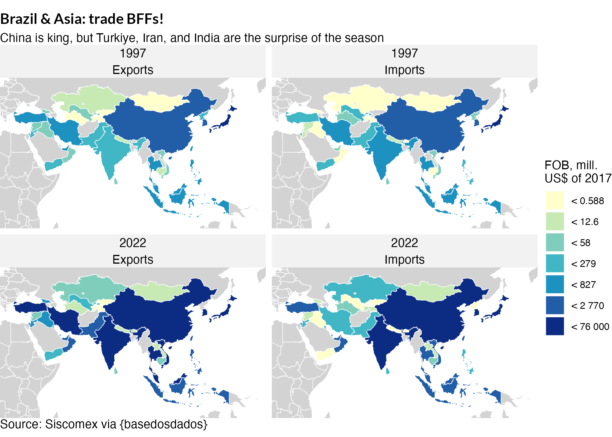
Day six: Asia
So an Asia map… What can I do that’s still related to what I know? Also, I’m very tired. So I just looked for trade values for 1997 and 2022 to see how imports & exports evolved in time and between countries. The scale was a hell of a nightmare as always, but I think this looks quite okay!
Day nine: hexagons
I gotta admit, I was in a slump for a few days. Day 8 was the day before my master’s thesis qualification, so I was very overwhelmed finishing my presentation etc. And once you stop producing, it’s hard to get back on track! Nonetheless, here I am.
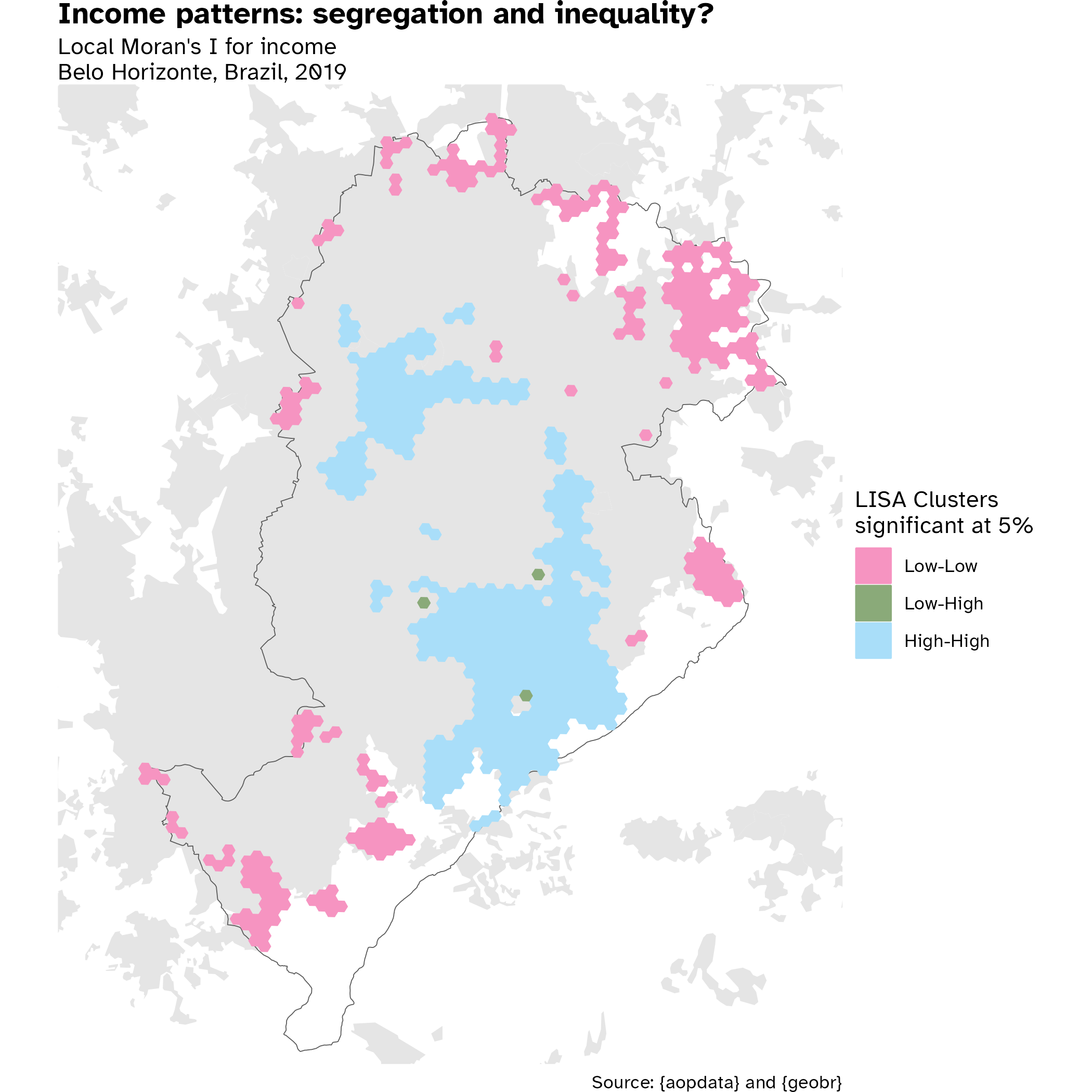
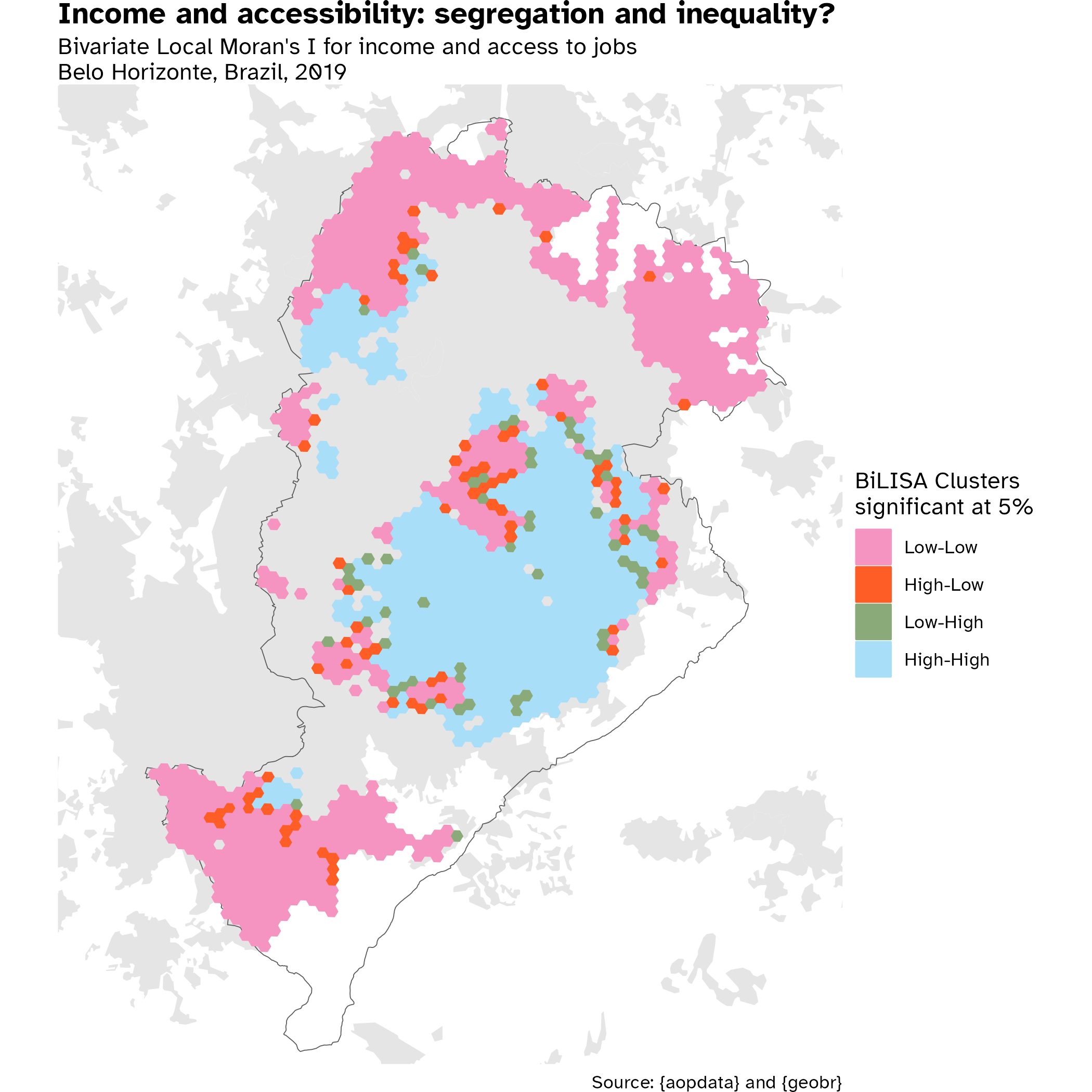
I love hexagon maps, especially the ones enabled by the great Access to Opportunities Project by Ipea… So this was a no-brainer for me: During my Spatial Econometrics course last year, we had to choose a theme and make all sort of spatial shenanigans with it—I’ll post a tutorial on spatial analysis one day!
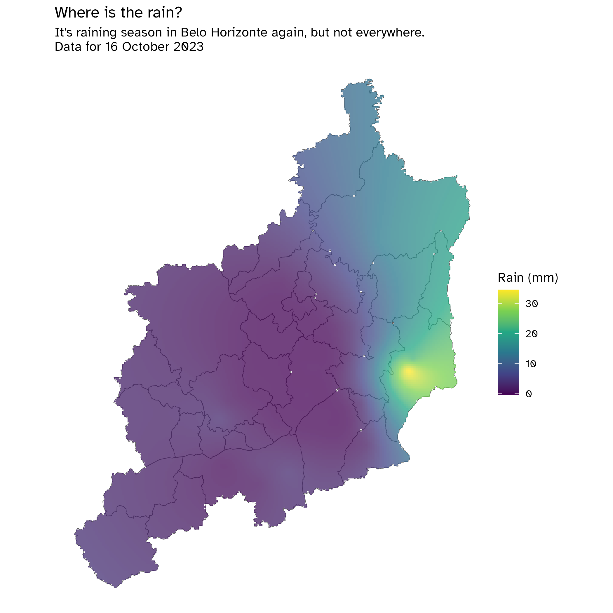
These maps are from my beloved home city, Belo Horizonte, capital of Minas Gerais. Home to 2.3 million inhabitants, it is at the heart of a 5.7 million inhabitant metropolis. It’s a shame we only have data for the capital, because the surrounding cities work as an interconnected labor market with very differing realities, but we can still capture striking patterns in the capital.
First, we have a local index of spatial autocorrelation (LISA) for income, based in the 2010 census—can’t wait to reproduce this with 2022 data, as soon as it gets released! The second is a bivariate index, comparing income and access to job opportunities.
Besides the ggplots, here I also used tmap for interactive viewing. I love these interactive maps, because they really allow you to see what’s going on by navigating through regions.
Univariate LISA for income
BiLISA for income and access to job opportunities
Day 11: a retro map
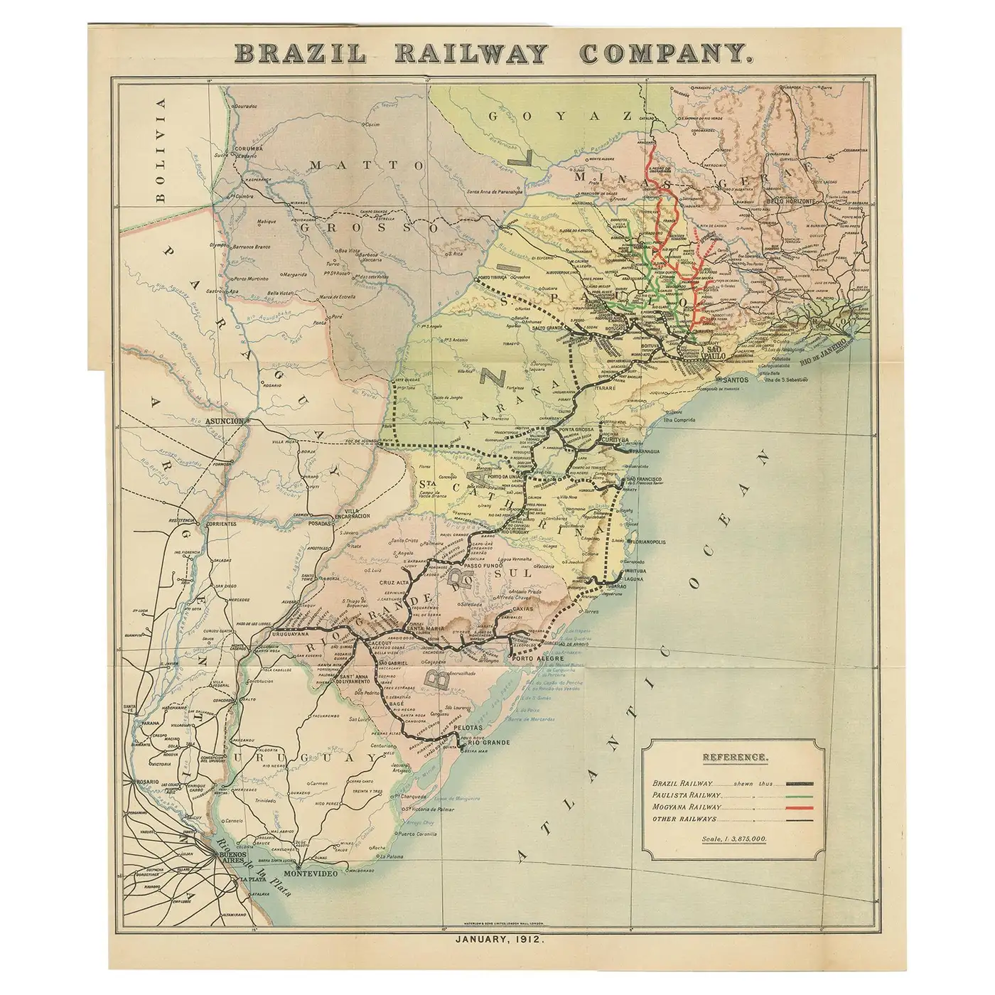
I have always loved antique maps, especially the 19th century ones. Here are some of my favorites that served as inspiration for today’s map:
So basically this is what I had to do: - adjust theme elements, e.g. plot.background, plot.title, and font; - use colors from an old map; - find online fonts that are similar to old map typography.
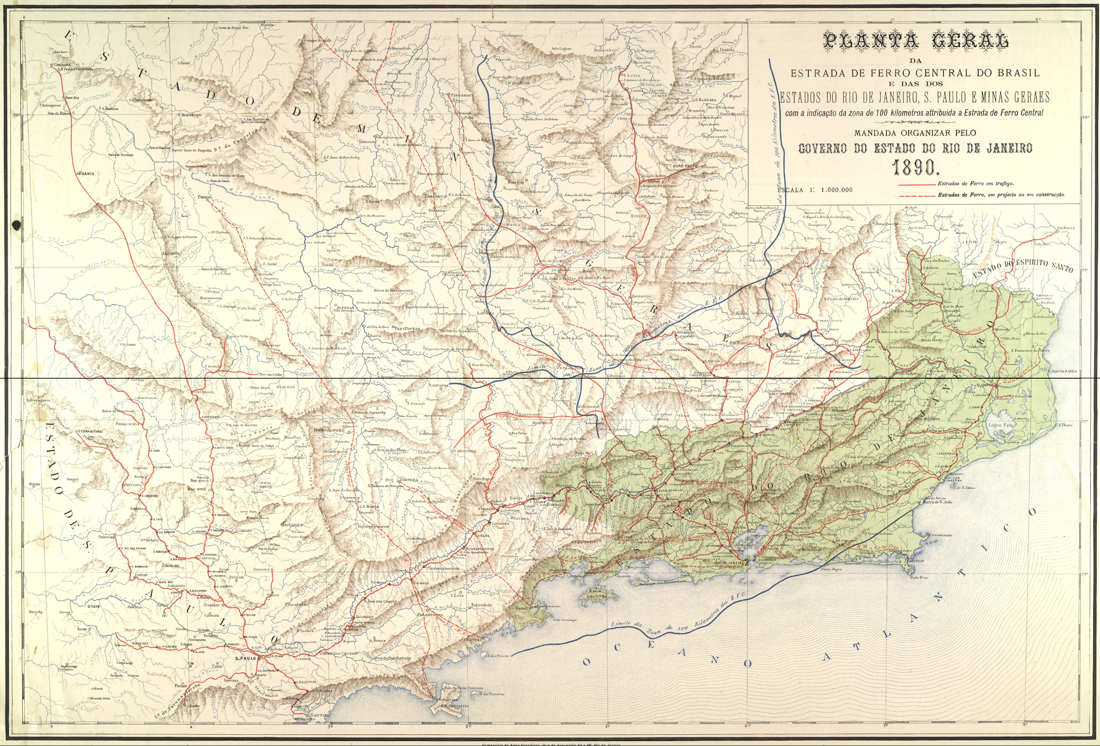
Since it is a retro map and not a historic one, this is the actual map of operating, under construction, and planned railways in Brazil, as of 2023. The railways shapefile was downloaded from ANTT, the national ground transportation agency.
I was highly on doubt if I should paint the ocean or not, but I ended up liking this version.
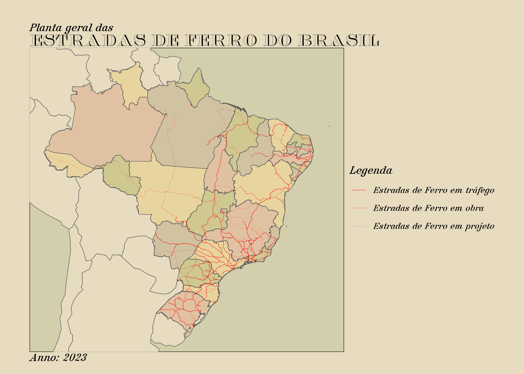
Fun fact
While researching maps, I found this interesting article (in Portuguese) about how football (yes I refuse to say soccer) teams in São Paulo state relate to railway history
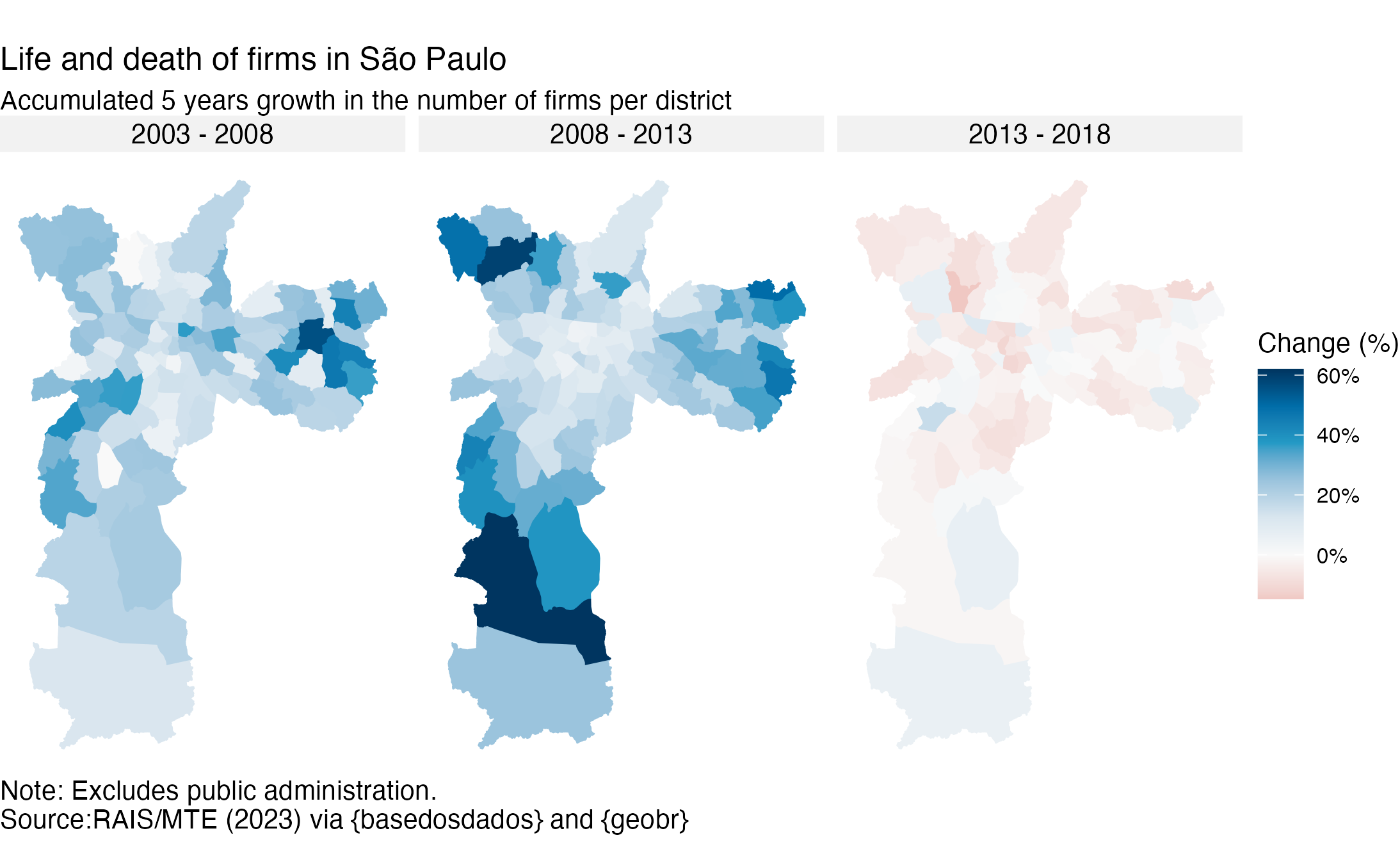
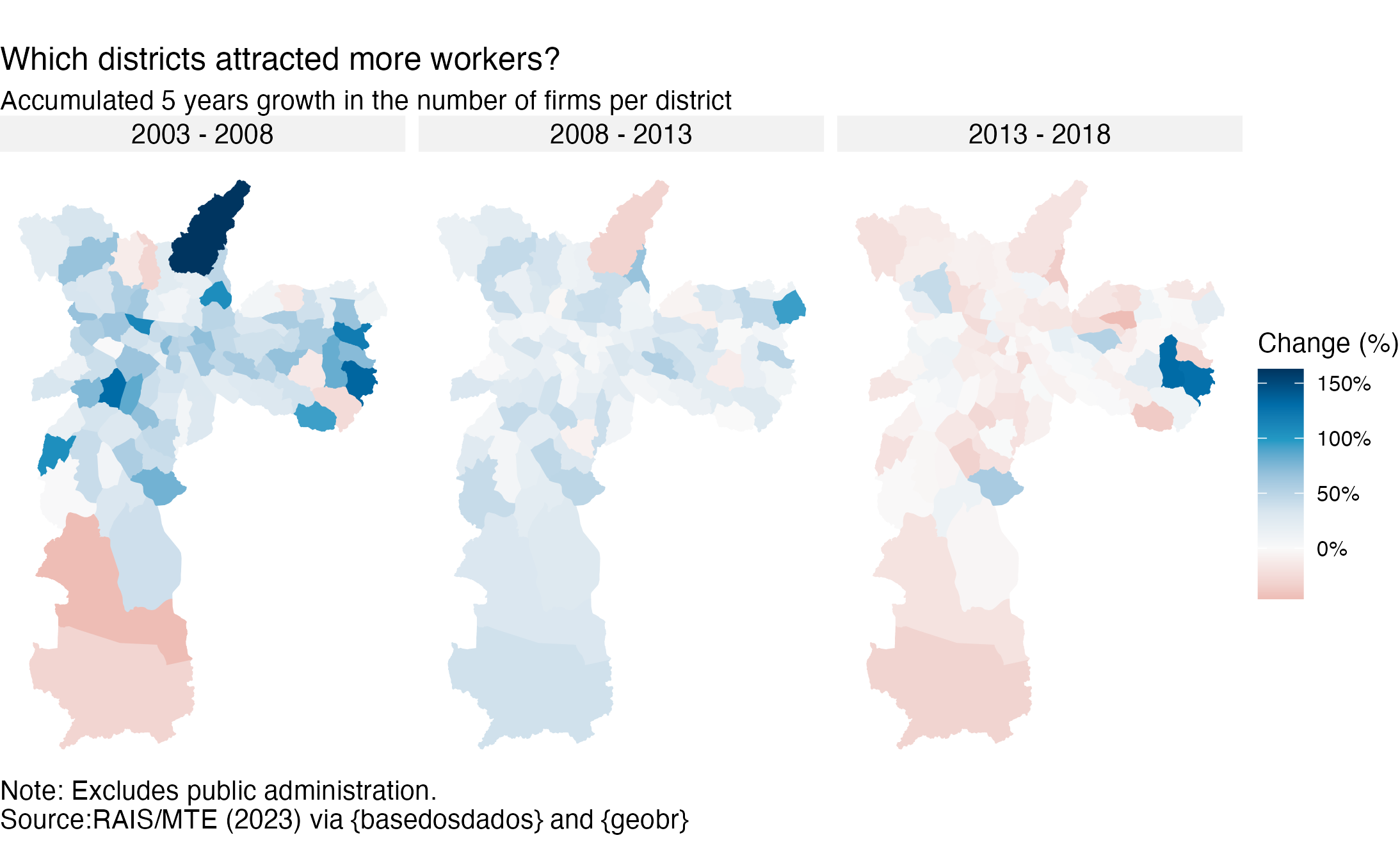
Day 13: Choropleth
Choropleths are among my favorite maps. In fact, whenever I think of making a map, I am thinking about it! But perhaps you don’t know what this fancy word means—I certainly did not before this challenge. In case you’re wondering, a choropleth is a map that colors polygons according to a variable.
I present here two choropleths from my master’s thesis1, both related to labor market growth in São Paulo between 2003 and 2018. We can see a similar trend on both, related to the overall Brazilian macroeconomic conditions in that period: rise in the first 10 years and fall from 2013 onwards, on both firm and employment growth.
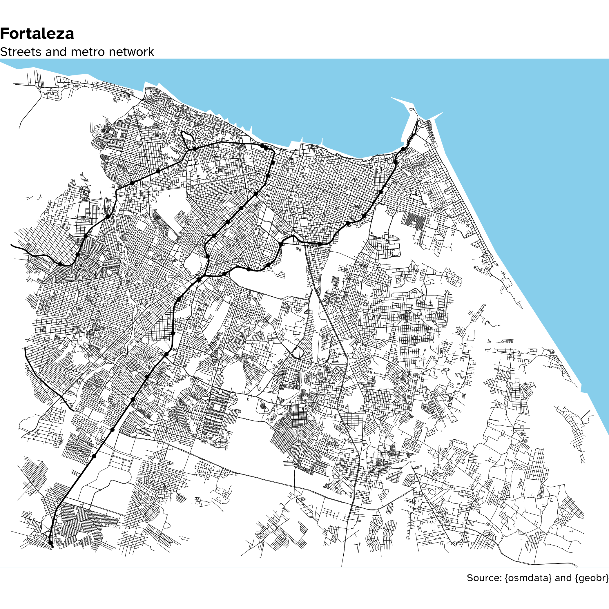
Day 15: OpenStreetMap
I love making maps with {osmdata}. It’s more easy than it seems! Also I made some wrapper functions in my {spatialops} package (work in progress) that facilitate it even more. I’ve chosen Fortaleza since it’s a major Brazilian city, yet it is very compact so it won’t take a lot of time and memory to query it—in contrast, I mapped once a fraction of São Paulo that ended up taking than 6 GB on the environment! Fortunately tho, when writing it to disk with saveRDS, it was a fraction of that.
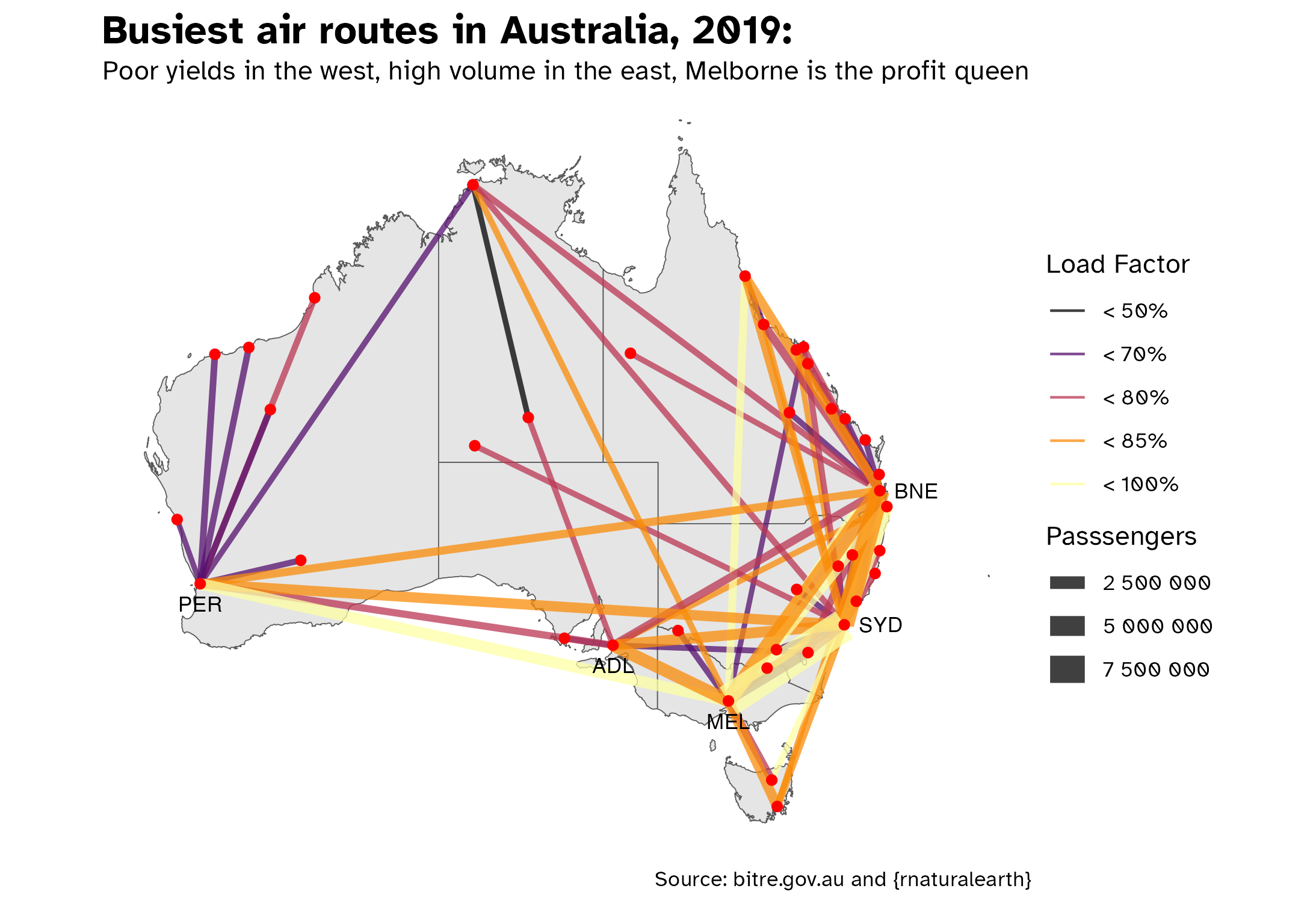
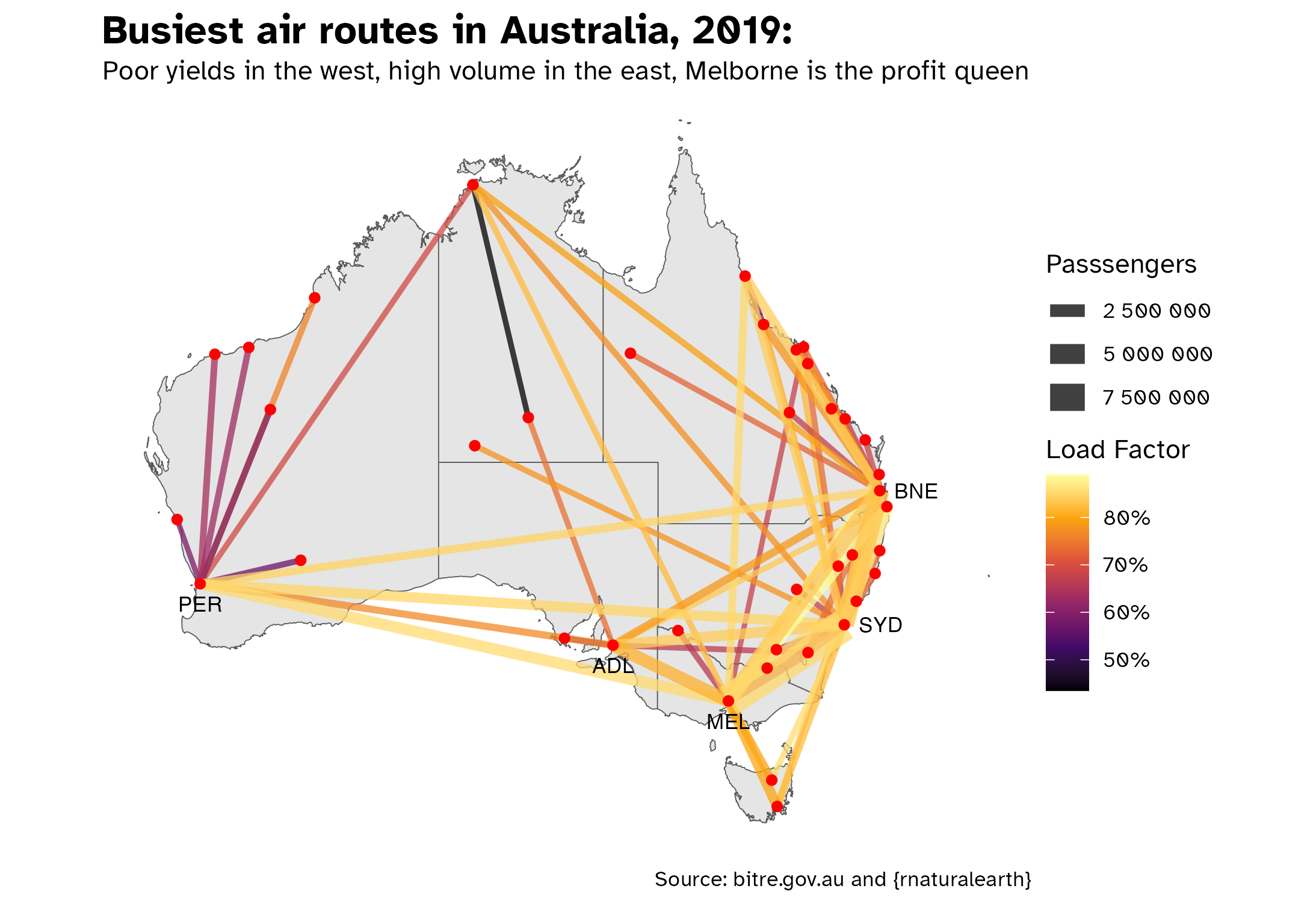
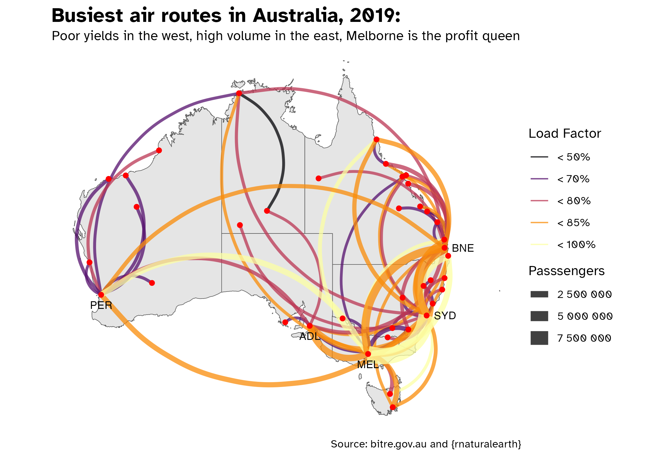
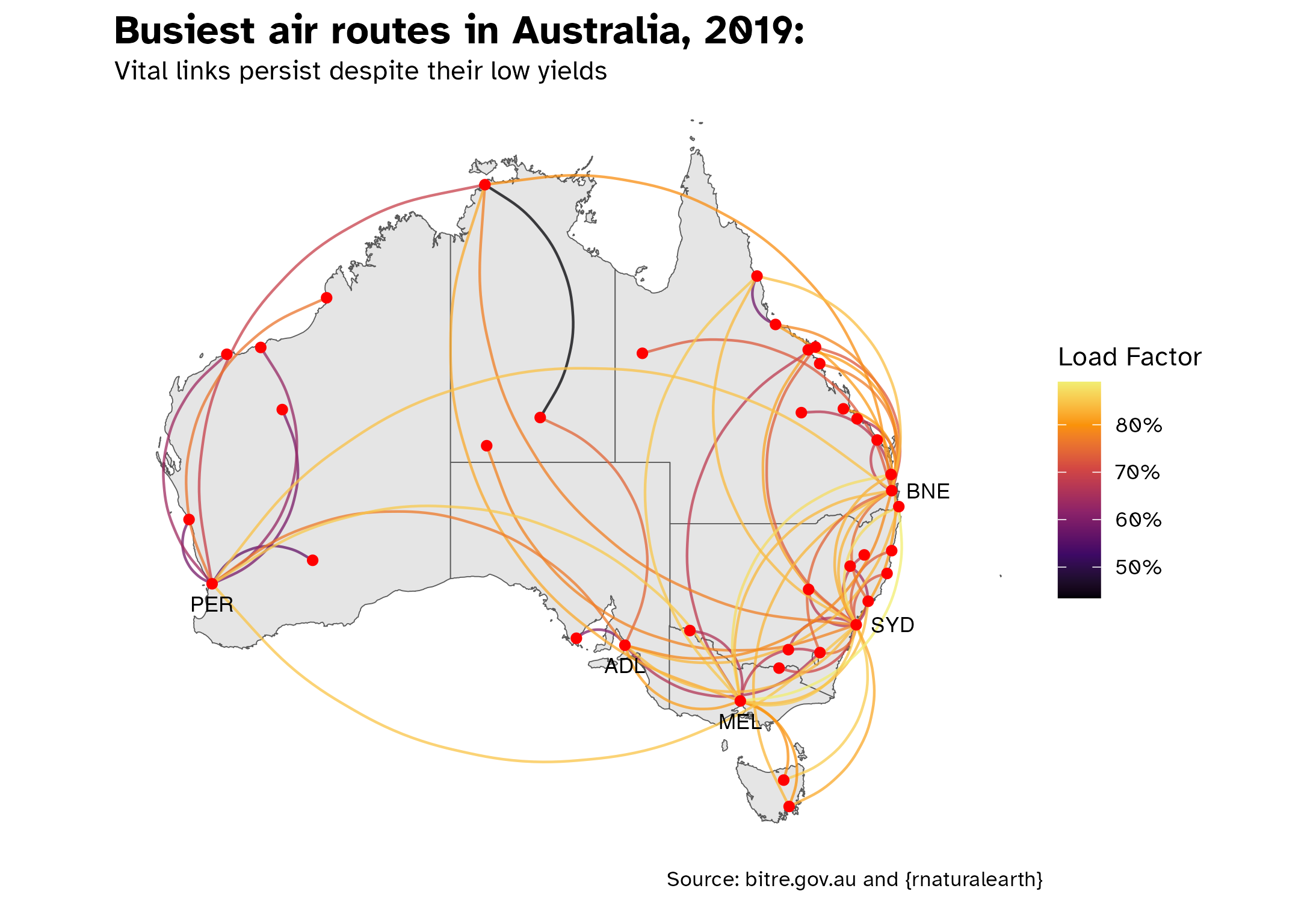
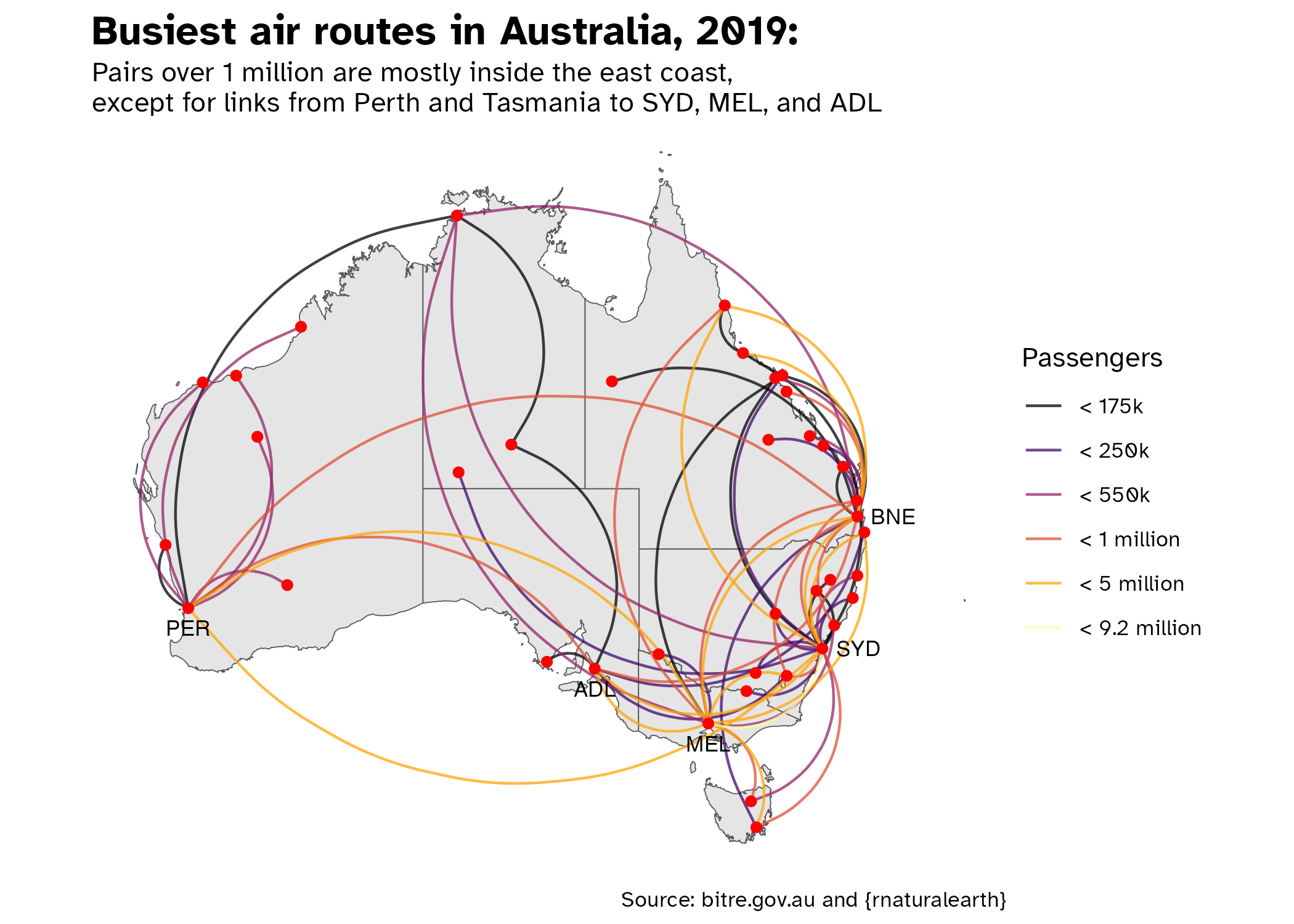
Day 16: Oceania
This is actually a combination of days 16 (Oceania) an 17 (flow). I am a moderate avgeek (as in I was a terminal avgeek before and now I moved to other obssessions such as trains cities maps), so I looked at domestic flight movements in Australia. This database was kinda hard to get, it does not consider all routes, and sadly there are some missing data.
I feel that us non-artistic folks (especially in academia) overlook the importance of producing visual material that is not just beautiful but actually conveys the desired information easily. For instance, I had a hard time getting the right combination of scales: continuous or binned? If binned, where should I cut? Color or linewidth? It comes down to storytelling as well, what’s your point? I couldn’t choose only one map, so I present you the combination. What’s your favorite?
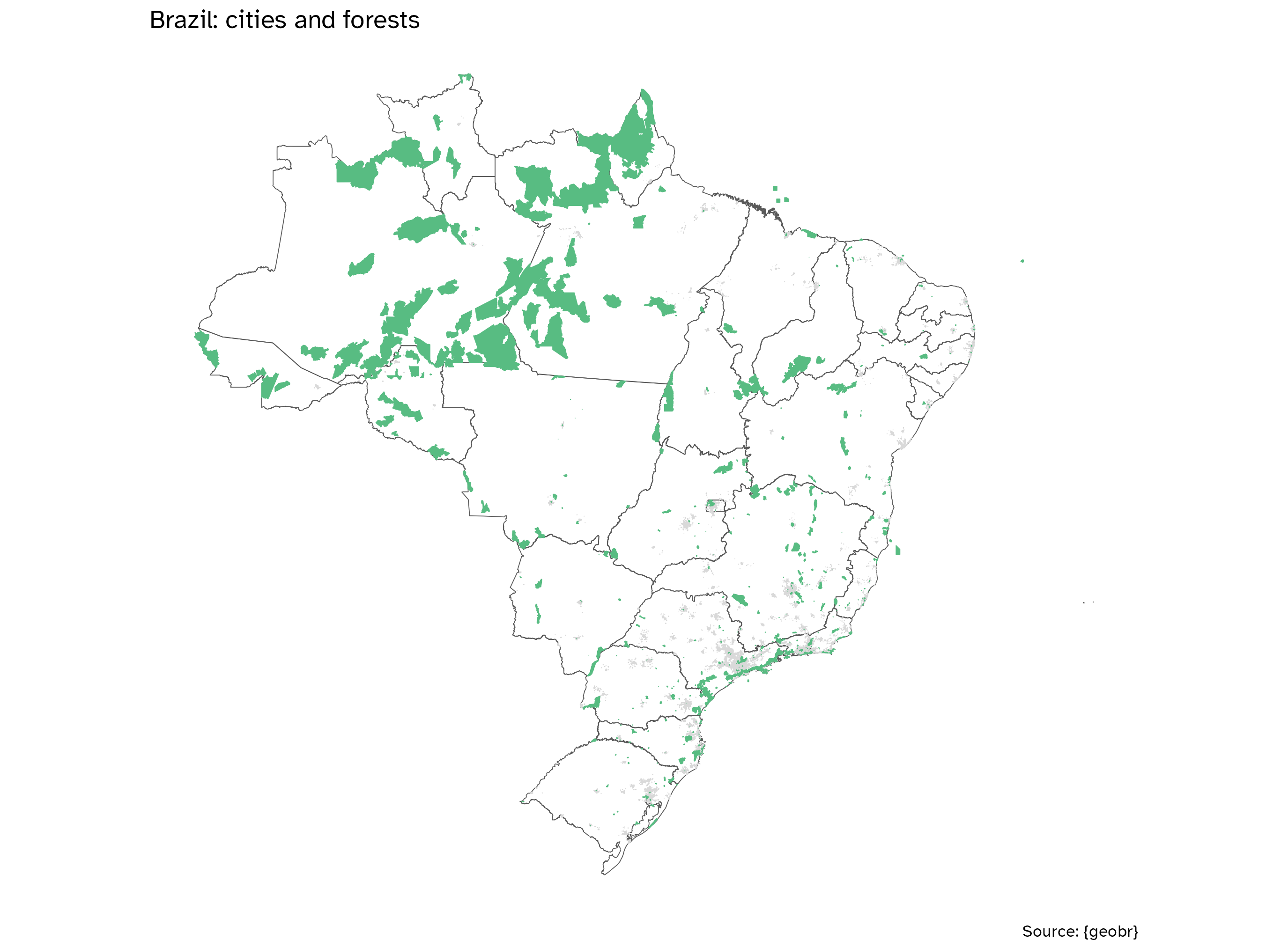
Day 19: Five minute map
Chop chop! I had to do the easiest thing possible, so there wasn’t much margin to be inventive. My intent was to show here once again how easy it is to use {geobr} and how rich the dataset is!
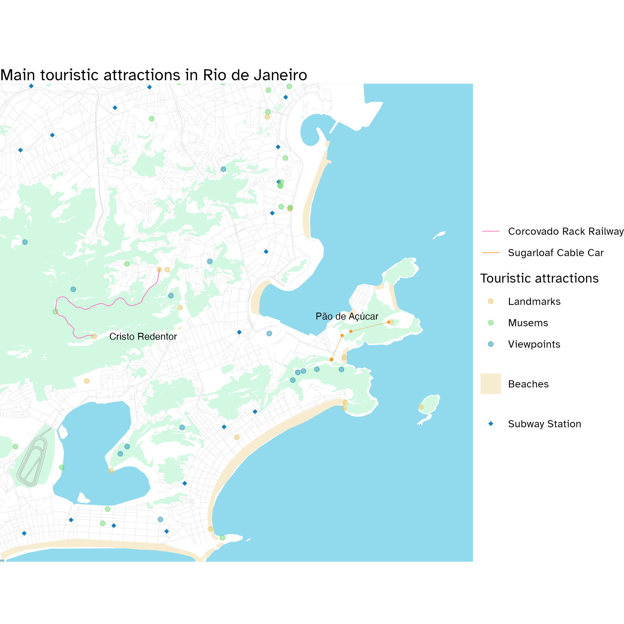
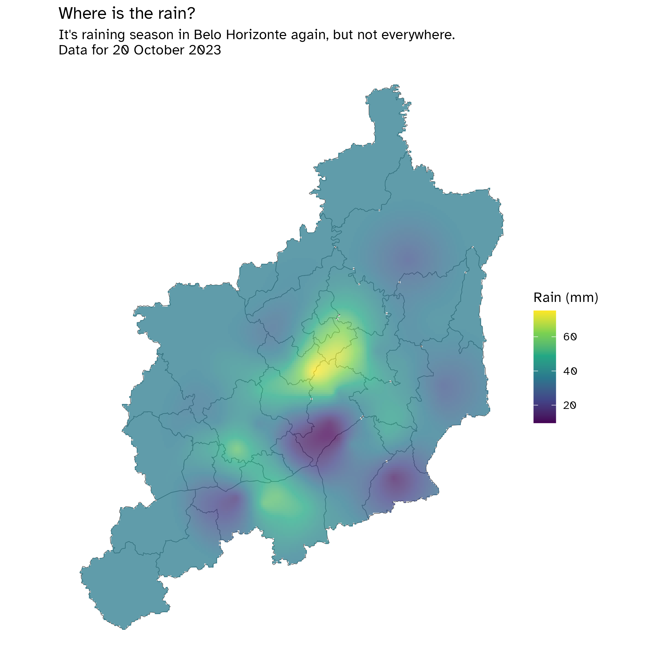
Day 20: Outdoors
Apesar de tudo… o Rio de Janeiro continua lindo!
If professing hate for Rio de Janeiro (and Brasília) was a sport, than I would bring more gold to Brazil than anyone ever has. Truth be told, while Rio makes me mad, I can’t deny it’s a wonderful city —and I’m not talking only of natural beauty, it has many amazing human-made stuff as well! Maybe I’m just really sad that our former capital is left abandoned and ransacked… by their own citizens sometimes.
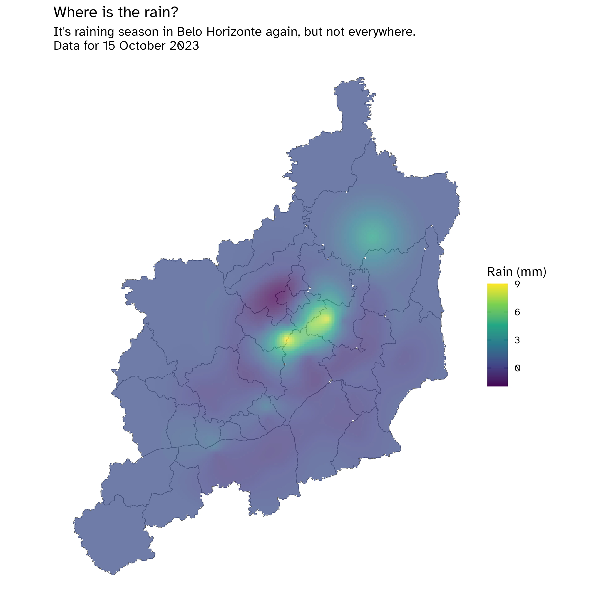
Day 21: Raster
I have never used a raster before, so this was exciting! I have been meaning to try spatial interpolation for a long time… I tried it before in 2021, but back then I was barely a teenager in terms of R knowledge (what am I now, tho?), it didn’t work, I got anxious and never tried it anymore. Now here it is, and I give my special thanks to these tutorials:
- It all started with Prof. Anselin’s tutorial on Kriging, but it wasn’t working very well…
- Then the R-Spatial book from Pebesma and Bivand saved me!
I still haven’t figured out why I can’t use a
sfgrid whenkrigeing (it is allowed according to the function reference), but since the raster worked well, it fits my purpose now.Fork me on GitHub
See me on Twitter
Day 22: North is not always up
This was very fun to make, because I never flipped a map before so I had no clue on how to do it. It was easier than I thought, tho: while I’m used to simply transforming the CRS by throwing the epsg code (and it’s always either 4326 or 4674 for me), this time I dealt with PROJ4 string and I gotta say… It’s cooler than I thought! This is how it works:
```{r}
#| label: day22-crs
crs <- "+proj=longlat +ellps=GRS80 +axis=wsu +no_defs +type=crs"
```- First,
+projtells us the projection type. For instance, this one islonglat, meaning that it is in the longitude-latitude format; another example is theutm(Universal Transverse Mercator) ellpsrefers to the ellipsoid in use, we don’t really change that bit but it makes clear that we are representing the earth as an ellipse.axisis what really matters here. By setting it towsu, that’s how we flip north and south.+no_defsprevents the inclusion of additional default parameters- Finally,
+type=crsis the type of coordinate reference system.
I’d like to say thanks to ChatGPT for helping me break down the PROJ4 string into bits!
Inspirations
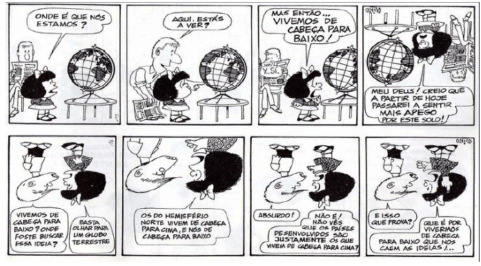
When thinking of south-orientation, two images instantaneously comes to my mind. The first is rather obvious for us Latin-Americans, the well-known south-oriented drawing of our continent with two meridians and a boat. And as my geography teacher Mariana insisted, map representation goes far beyond cartography. Since they’re all depictions of reality, our choices matter… a lot. This topic has already been exhaustively debated and I’m definitely not an expert; however, I do believe we better not use Mercator when possible.

The second one is a Mafalda comic. I used to love them when I was a child, as I identified a lot with Mafalda.
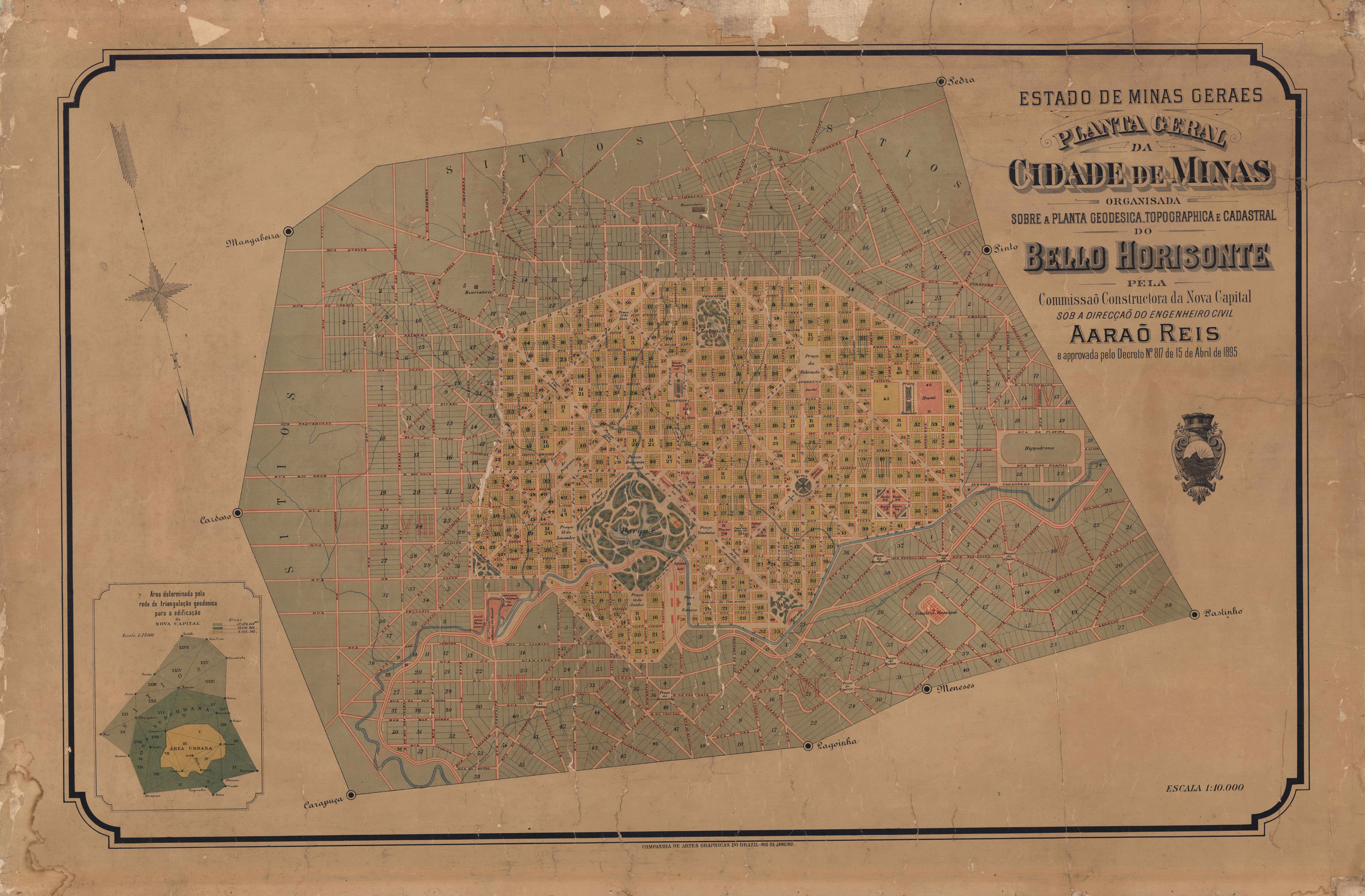
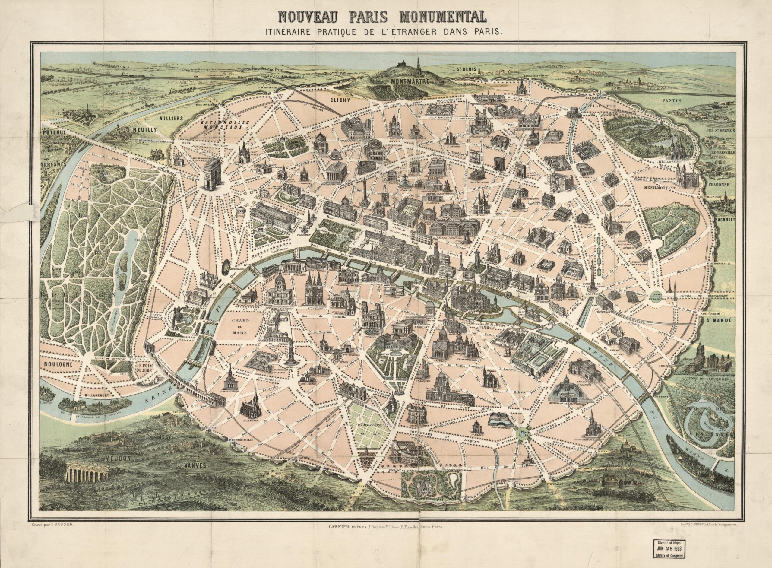
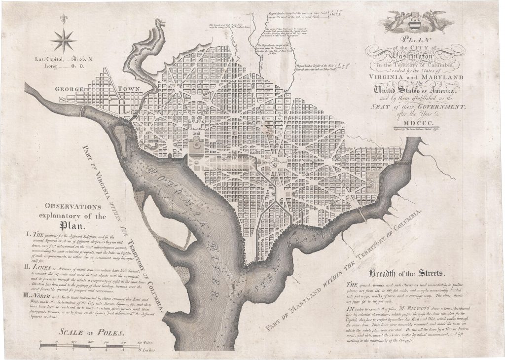
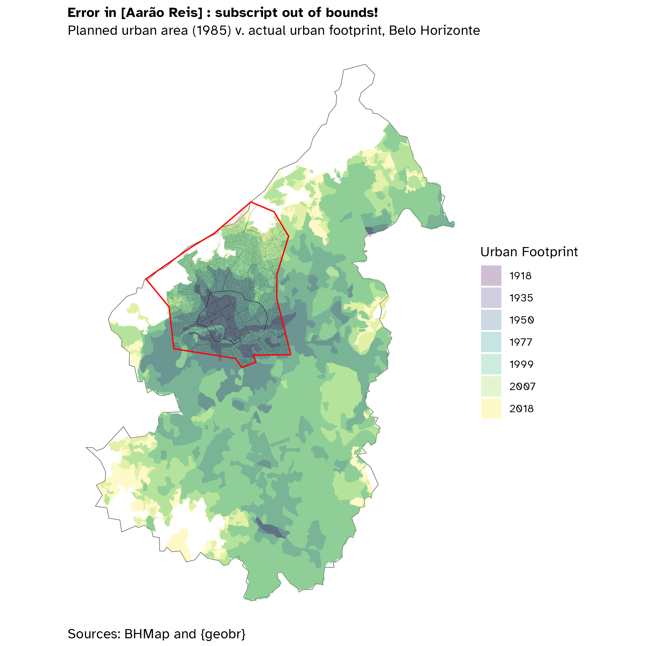
But once again, I’ve chosen to talk about Belo Horizonte. If you look back to Section 7, the original plan for Belo Horizonte is south-oriented! As far a I know, specific orientations were more common back in the day, but still I haven’t seen many of them. And to be fair, I have no idea why Aarão Reis decided to use a south-orientation, since if we think about it, the port of arrival to the new capital was the east through the Central do Brasil railway. Fun fact, btw: the rail came fist and the city came second, as the railway was a backbone to transport material to the city construction!
For those that unaware, Belo Horizonte had two major inspirations. The clearest of them is Paris: a circular surrounding the urban core; inside of it, a street grid that crosses large, green boulevards, making little plazas in the corners. Washington was also a minor inspiration, since the grid layout is closer to L’Enfant’s than Haussmann’s.
However, the second inspiration was the City Beautiful movement—in Brazil, we call it Cidade Jardim, or Garden City. This urban paradigm was founded in England by Ebenezer Howard in the lat 19th century, so it was very avant-garde: Belo Horizonte was planned between 1893-1895 and inaugurated only two years later (with a lot of work to be done in the next decades, tho)! At the heart of City Beautiful lies the miasma theory: they believed that some diseases such as cholera spread through the air (now we know that it’s basically a sewage issue) and used this a justification to condemn what was seen as “too much” density.
On the good side, they loved trees and this indeed leads to beautiful city… But the bad consequence is that they advocated for smaller cities at every cost. Because they did not understand the concepts of agglomeration economies—Alfred Marshall had barely published his Principles of Economics—, they saw density as an inherently bad thing, that’s why they proposed a network of idyllic, small to average cities, all of them surrounded by agrarian lands and green belts.
It all looks beautiful, but… For who? In Belo Horizonte, it certainly was for the state oligarchies. Reis’ plan2 divided the city in three. The urban zone, inside the circular avenue, is where people were supposed to live and work; most amenities (e.g. the Municipal Park and the Central Station) were built there. The suburban zone would have a sparser grid, allowing low density housing and some less desirable/big venues such as the slaughterhouse, the graveyard, and the (horse) riding club. Finally, the third would be the farms zone, dedicated to small crops and livestock to feed the city. The named edges outside this plant, I believe, are the names of the surrounding estates: back then, Belo Horizonte was no more than a little village.
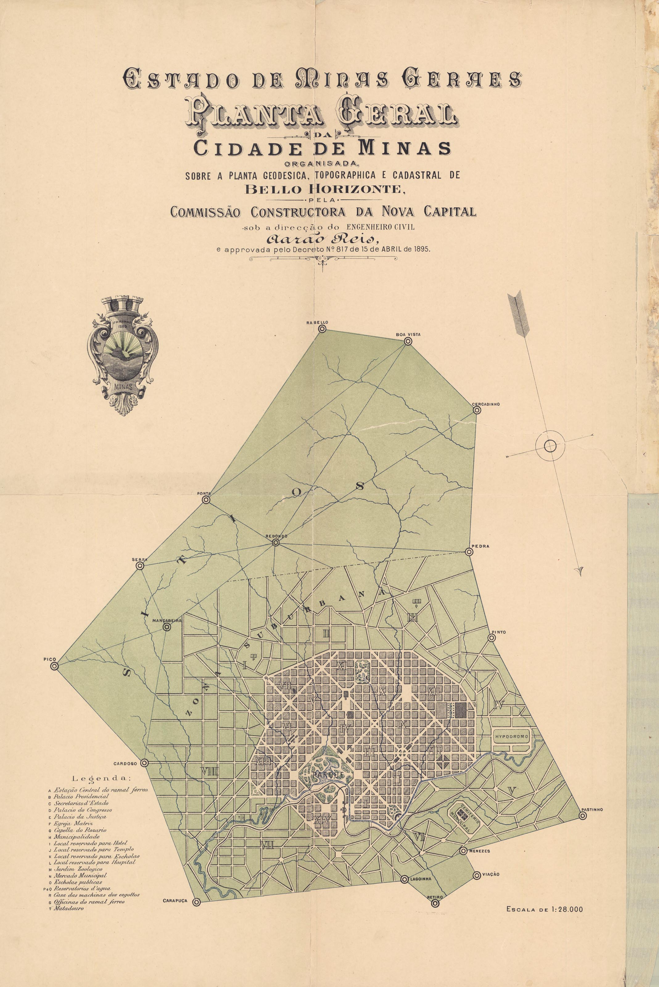
In practice, what happened is that the urban part was mostly occupied by the elites, whereas construction workers, besides a portion of Barro Preto neighborhood (which now is mostly trade, services, and offices) in the urban zone, spread through the supposedly suburban zone. From my mother side, I ascend from Italian immigrants that put their blood to build Belo Horizonte, and I grew up hearing all kinds of stories from that time. Many Italian immigrants, like my family, clustered in three neighborhoods: Santa Teresa (east), Prado/Barroca/Calafate (west), and Barro Preto. Belo Horizonte grew exponentially until the 1970s, rapidly occupying most of its area and merging with neighboring cities, giving rise to the country’s third biggest metropolitan area (seventh in South America). But as we can see, while this growth was centered in the original urban zone, there were also some clusters here and there, such as Venda Nova in the north (bottom of the map!) and Barreiro in the southwest.
Cut the crap, gimme the map
Day 25: Antarctica
I don’t have much to say about Antarctica… But imagine visiting other research base and suddenly it’s another day!
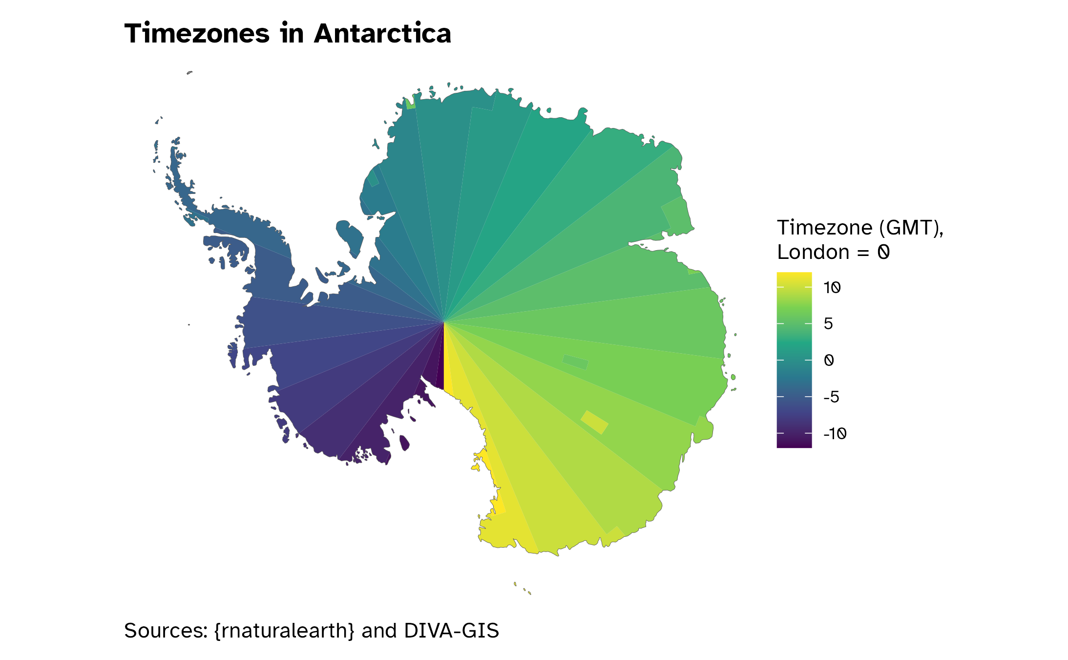
Ps.: What if we use the Antarctic Polar Stereographic to project the whole world? Parece que o jogo virou, não é mesmo? I can barely see Brazil, less even Antarctica
Day 26: minimal
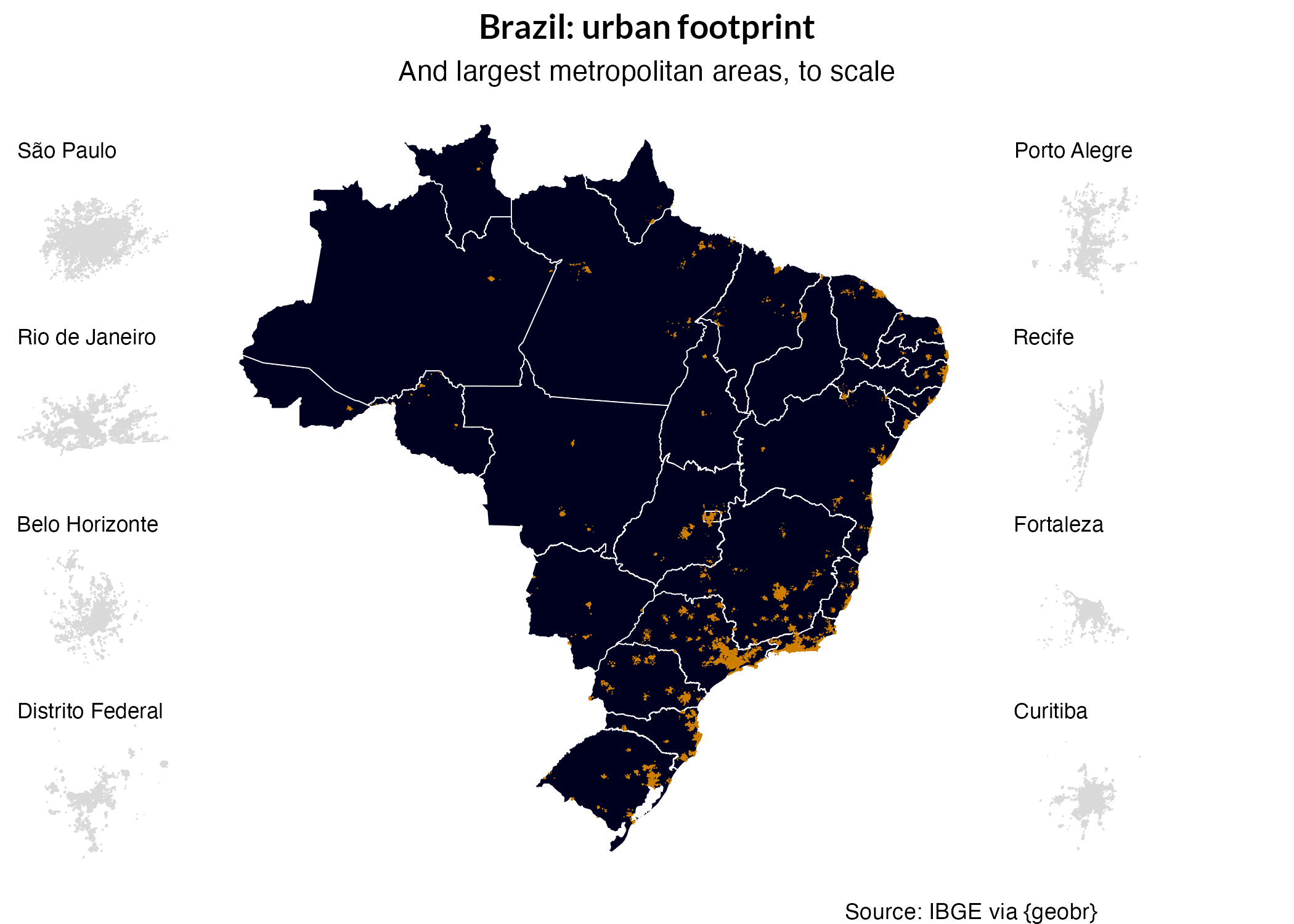
this one turned better than i expected, albeit a little depressing! kudos to itdp for their awesome base at mobilidados.
i use the same strategy from day 3 to put every city in the same scale… but this creates some odd shapes, like teresina. because the rail is centered but there are no borders, it looks like the railway is right aligned, when it is not.
these are all the urban rail systems in brazil, regardless of the service quality or frequency. 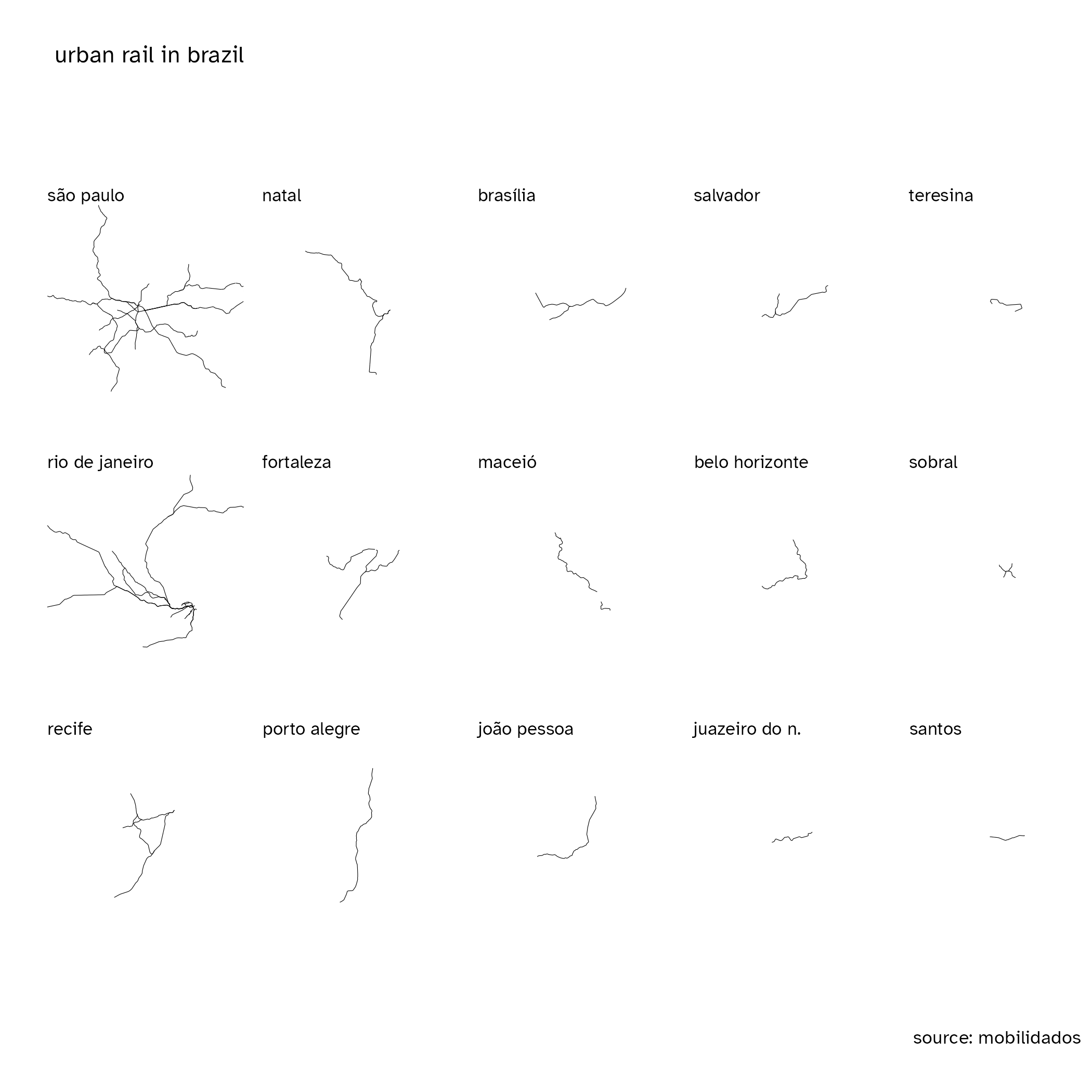
however, we know not all of them are equal. using mobilidados’ classification as average-to-high capacity transit, i generated a new map which basically ruled out infrequent service in single track systems, while still leaving some tram systems such as santos and sobral. 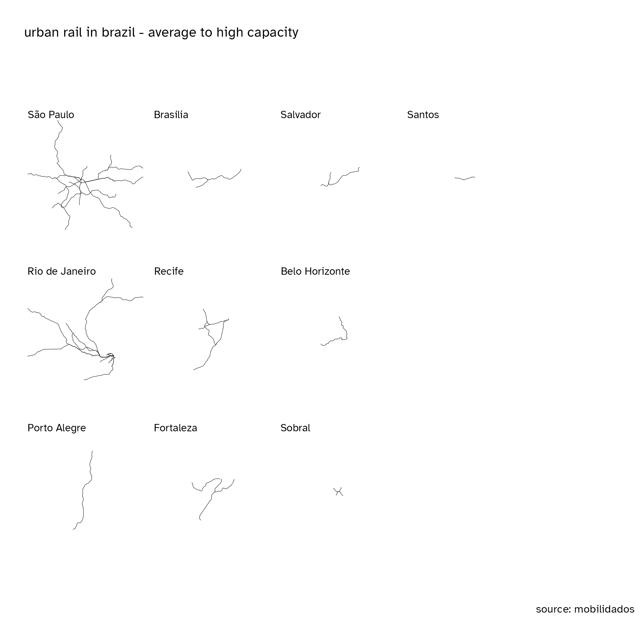
alas, as my friend heitor villa-doidos noted, many people were shocked with the existence of light rail systems in ceará outisde of the capital, so i made a special map only for them (fork it here).
you may be wondering why there’s a hole in maceió’s map. sadly, it is not a bug: a portion of the network is suspended since a whole neighborhood started sinking due to rock salt mining nearby.
Day 27: Dot
I love bubblemaps! One advantage over regular choropleths is that areas are misleading. For instance, on a voting map, small towns inside a big municipality give a false impression of more votes than in a very dense city in a small territory. I had no time to make a map that day, but fortunately, I did a bubblemap with my friends Marcello and Igor last year for voting patterns in Minas Gerais.
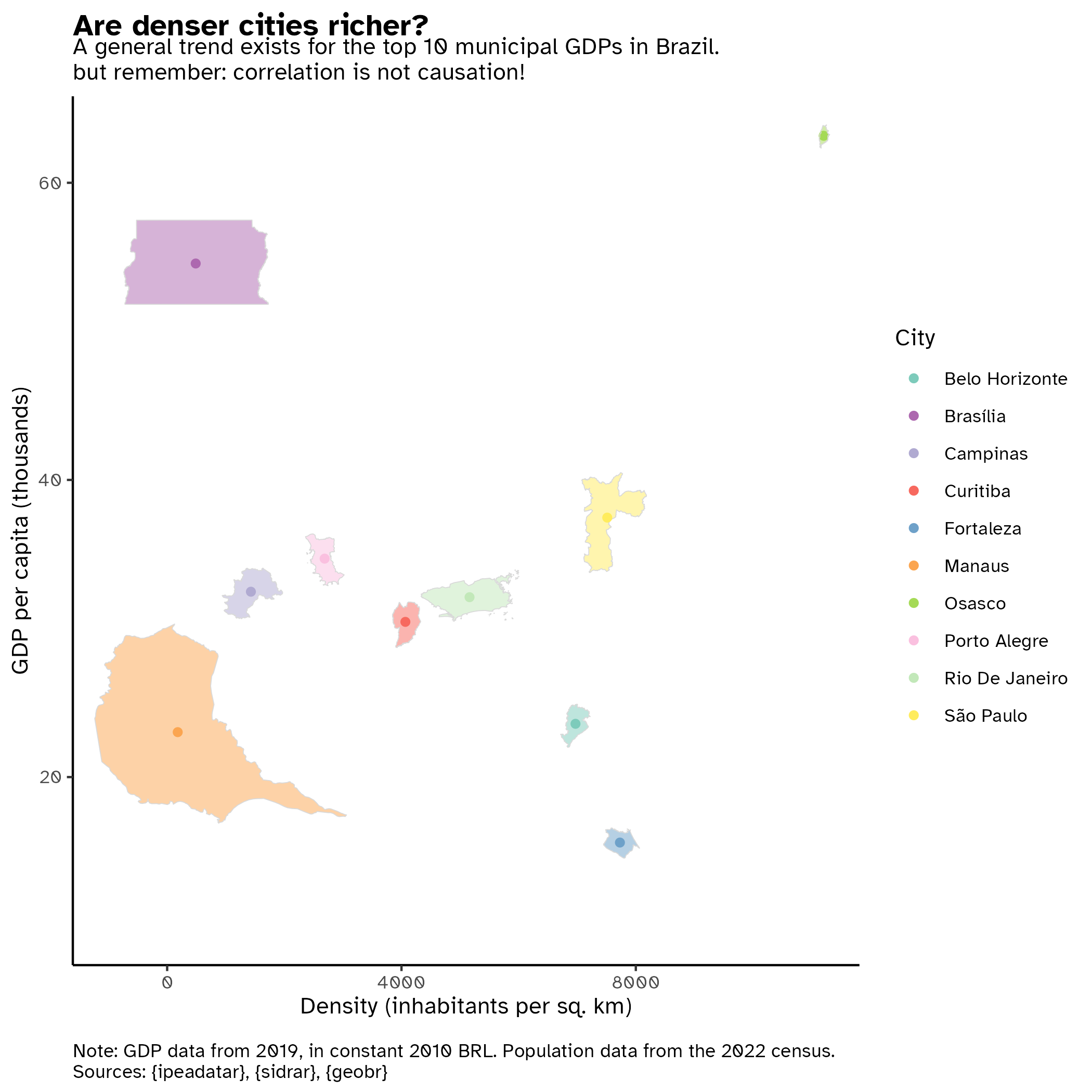
Day 28: is this a map or a graph?
I had a hard time thinking what to do for this, and all I could see over twitter was clearly…maps, but with bubbles everywhere. C’mon guys, this was yesterday’s theme! So I had an idea: what if I make a dispersion graphic, but I represent each city with their polygon instead of a point? It was a bit hard, but it actually follows the same logic from days 3 and 26: all I had to do was nail each city’s coordinates! I explain everything in the github repo below.
This was a simple dispersion analysis of density and GDP per capita for the 10 Brazilian cities with highest output (overall, not per capita) in 2019. Also, since the polygons are to scale and cities are ordered by density, we can have a notion of their population without knowing anything.
Epilogue
November was definitely a month. I couldn’t keep up with all of it, but I loved doing these maps! I had great interactions on twitter, as people seemed to enjoy these maps as well… And it was surprising to see that some maps unexpectedly gained more attention than I thought —I’m talking about you, day 4!— while others that you pour your heart and soul (day 22…) are a flop. I do these things for myself, tho, as I write these lines for myself too. I think it’s great if someone enjoys them, but I’m very happy just for making maps :)
Footnotes
I feel very presumptuous saying master’s thesis instead of dissertation, but apparently they got the titles inverted in North America and I use American English, so…↩︎
check it in full resolution at the State’s Public Archive: http://www.siaapm.cultura.mg.gov.br/modules/grandes_formatos_docs/photo.php?lid=88↩︎
Citation
BibTeX citation:
@online{bazolli_alvarenga2023,
  author = {Bazolli Alvarenga, Arthur},
  title = {30 Day {Map} {Challenge} 2023},
  date = {2023-11-05},
  url = {https://baarthur.github.io/posts/2023-11-05-mapchallenge/},
  langid = {en}
}
For attribution, please cite this work as:
Bazolli Alvarenga, Arthur. 2023. “30 Day Map Challenge
2023.” November 5, 2023. https://baarthur.github.io/posts/2023-11-05-mapchallenge/.